
As part of the automatic update process we are able to collect statistics on CTGP-R usage each day. This page updates automatically.
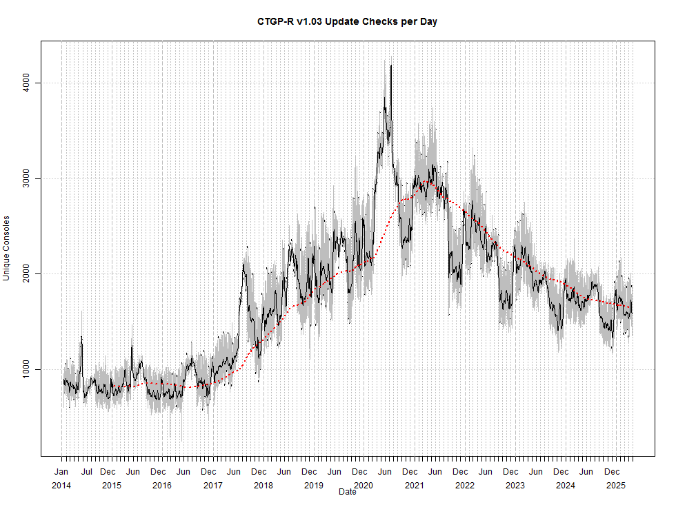
This graph approximates the number of people who use CTGP-R each day. It shows the number of distinct consoles that check for automatic updates each day. Consoles which do not check for updates (for example, because automatic updates are disabled) are not included. The thin gray line shows the day to day fluctuations in number of users. The black line is the weekly average (7 point moving average). Clearly visible in this line are seasonal fluctuations such as Christmas and school holidays. Also clearly visible is the spike on the date Nintendo Wi-Fi Connection was terminated (20th May 2014) as well as the anniversary of that date. A very noticable surge occurs in July 2017 which appears to be the result of a shoutout for CTGP by Jcool114 at the SGDQ 2017 charity streaming marathon. Finally, the dashed red line is the yearly average (365 point moving average) which shows the overall trend in usage, ignoring seasonal variations.
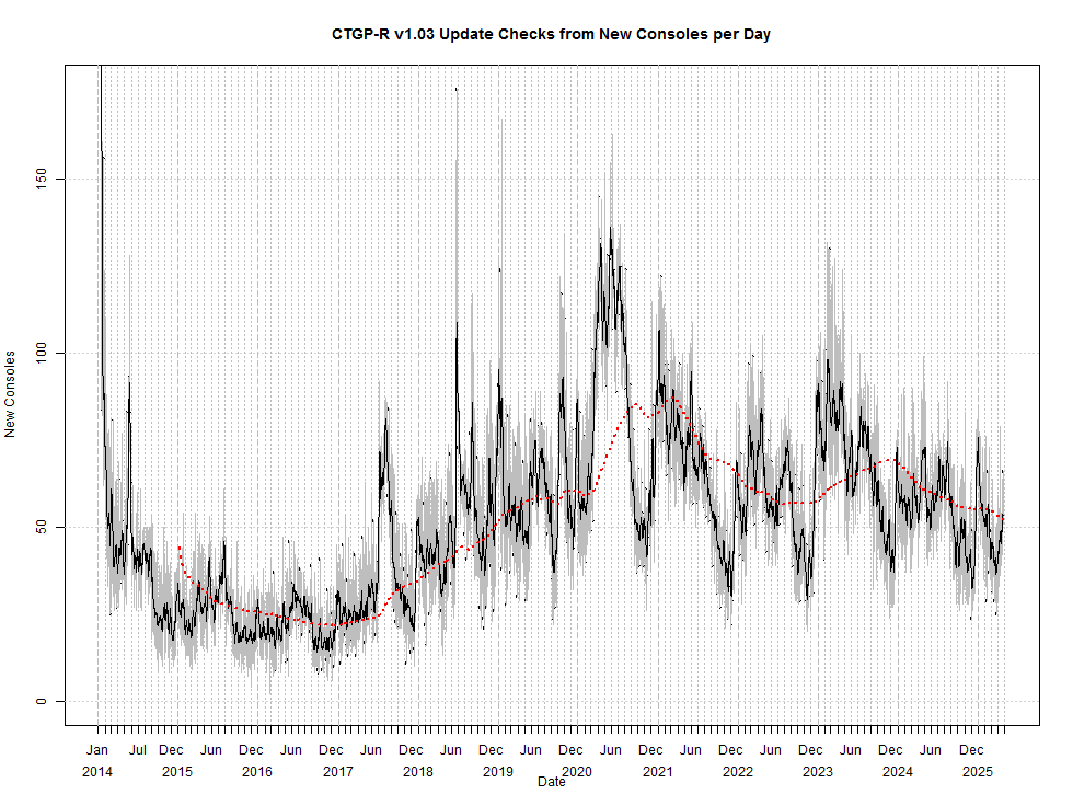
This graph approximates the number of new CTGP-R users each day. It shows the number of consoles that check for automatic updates for the first time ever each day. Consoles which do not check for updates (for example, because automatic updates are disabled) are not included. The thin gray line shows the day to day fluctuations in number of users. The black line is the weekly average (7 point moving average). A vey noticable surge occurs in June 2018 which appears to be the result of a tutorial video by Twd98. Finally, the dashed red line is the yearly average (365 point moving average) which shows the overall trend in usage, ignoring seasonal variations.
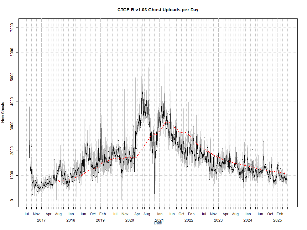
This graph shows the number of time trial ghosts uploaded by CTGP-R users each day. The thin gray line shows the day to day fluctuations. The black line is the weekly average (7 point moving average). Clearly visible in this line are seasonal fluctuations such as Christmas and school holidays. Finally, the dashed red line is the yearly average (365 point moving average) which shows the overall trend in usage, ignoring seasonal variations.